NOAA Teacher at Sea
Denise Harrington Almost Aboard NOAA Ship Rainier April 6 – April 18, 2014
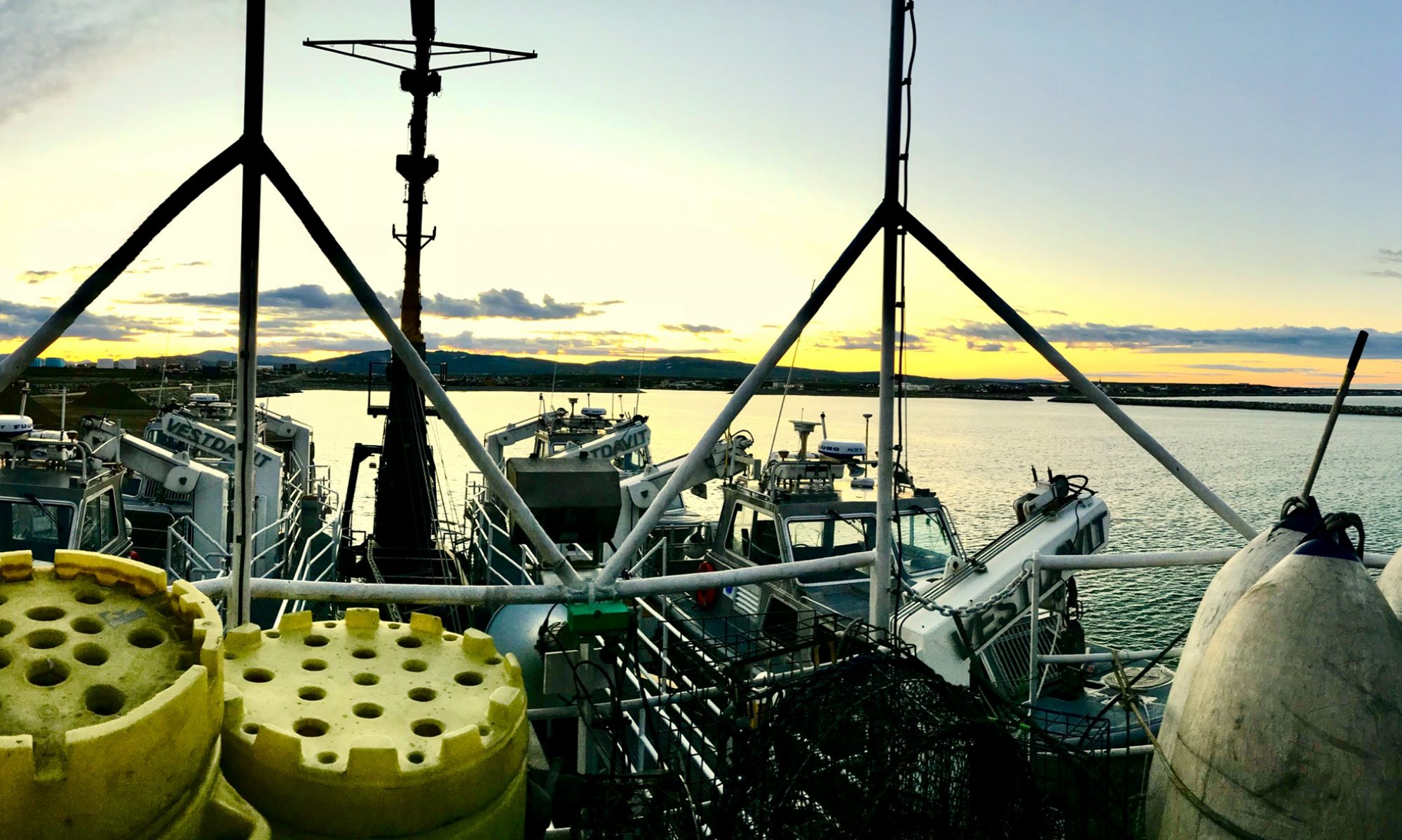
Mission: Hydrographic Survey Geographical area of cruise: North Kodiak Island Date: March 28, 2014
My name is Denise Harrington, and I am a second grade teacher at South Prairie Elementary School in Tillamook, Oregon. Our school sits at the base of the coastal mountain range in Oregon, with Coon Creek running past our playground toward the Pacific Ocean. South Prairie School boasts 360 entertaining, amazing second and third grade students and a great cadre of teachers who find ways to integrate science across the curriculum. We have a science, technology, engineering and math (STEM) grant that allowed me to meet Teacher at Sea alumni, Katie Sard, who spoke about her adventures aboard NOAA Ship Rainier. I dreamed about doing something similar, applied, and got accepted into the program and am even on the same ship she was!
In Tillamook, we can’t help but notice how the tidal influence, flooding and erosion affect our land and waters. Sometimes we can’t get to school because of flood days. The mountainside slips across the road after logging, and the bay fills with silt, making navigation difficult. As a board member for the Tillamook Estuaries Partnership (TEP), I am proud to see scientists at work, collecting data on the changing landscape and water quality. They work to improve fish passage and riparian enhancement. Working with local scientists and educators, our students have also been able to study their backyard, estuary, bays and oceans.
Now that we have studied the creek by our school, the estuary and Tillamook Bay, with local scientists, it seems to be a logical progression to learn more about our larger community: the west coast of the North American Continent! I hope the work we have done in our backyard, will prepare students to ask lots of educated questions as I make my journey north on Rainier with scientists from the National Oceanic and Atmospheric Administration (NOAA) north to Alaska.
NOAA has the best and brightest scientists, cutting edge technology and access to the wildest corners of the planet we live on. And I have got the most amazing assignment: mapping coastal waters of Alaska with the best equipment in the world! NOAA Ship Rainier is “one of the most modern productive hydrographic survey platforms of its type in the world.” Rainier can map immense survey areas in one season and produce 3-D charts. These charts not only help boaters navigate safely, but also help us understand how our ocean floor is changing over time, and to better understand our ocean floor geology and resources, such as fisheries habitat. Be sure to check out the Rainier link that tells more about the ship and its mission. http://www.moc.noaa.gov/ra
Rainier is going to be doing surveys in “some of the most rugged, wild and beautiful places Alaska has to offer,” says the ship’s Commanding Officer CDR Rick Brennan. I am so excited for this, as an educator, bird surveyor, and ocean kayaker. After departing from Newport, Oregon on April 7th, we will be travelling through the Inside Passage of British Columbia, the place many cruise ships go to see beautiful mountains and water routes. I have many more questions than I do answers. What kinds of birds will I see? Will I see whales and mountain peaks? Will the weather cooperate with our travels? Will the crew be willing to bear my insatiable questions?
Once we are through the Inside Passage, we will cross the Gulf of Alaska, which will take 2 ½ days. As we pass my brother’s home on the Kenai River, I will wave to him from the bow of Rainier. Will he see me? I think not. Sometimes I forget how big and wild Alaska is. Then we will arrive on the north side of Kodiak Island where we will prepare for a season of survey work by installing tide gauges.
I always love to listen to students’ predictions of a subject we are about to study. What do I know about tide gauges? Not a lot! Even though I can see the ocean from my kitchen window, I cannot claim to be an oceanographer or hydrographer. I had never even heard the word “hydrographer” until I embarked on this adventure! I predict I will be working with incredibly precise, expensive, complicated tools to measure not just the tide, but also the changes in sea level over time. I am excited to learn more about my neighbor, the ocean, how we measure the movement of the water, and how all that water moving around, and shifting of the earth affects the ocean floor. I am proud to be a member of the team responsible for setting up the study area where scientists will be working and collecting data for an entire season. It will surely be one of the greatest adventures of my lifetime!
Here are my two favorite travelling companions and children, Martin and Elizabeth.
In my final days before I embark, I am trying to pick up the many loose ends around the Garibaldi, Oregon home where I live with my dorky, talkative 18 year old son and 16 year old daughter who take after their mother. They share my love of the ocean and adventure. When they aren’t too busy with their friends, they join me surfing, travelling around the world, hiking in the woods, or paddling in our kayaks. Right now, Elizabeth is recovering from getting her tonsils out, but Martin is brainstorming ways to sneak my bright orange 17 foot sea kayak onto Rainier next week. I moonlight as a bird surveyor, have taxes to do and a classroom to clean up before I can depart on April 6. Once Rainier leaves Newport, I will become a NOAA Teacher at Sea, leaving Martin, Elizabeth and my students in the caring hands of my supportive family and co-workers.
Here I am having fun with kayaking friends in California in December.
Having gone through the Teacher at Sea pre-service training, I feel more prepared to help the crew, learn about all the jobs within NOAA and develop great lesson plans to bring back to share with fellow educators. I want to bring back stories of scientists working as a team to solve some of our world’s most challenging problems. And I am looking forward to being part of that team!
NOAA Teacher at Sea Susy Ellison Aboard NOAA Ship Rainier September 9 – 26, 2013
Mission: Hydrographic Survey Geographic Area: Carbondale, CO Date: November 5, 2013
Weather: You can go to NOAA’s Shiptracker (http://shiptracker.noaa.gov/) to see where the Rainier is and what weather conditions they are experiencing while I am back at school in Glenwood Springs, CO.
GPS Reading: 39o 24,13146 N 107o 12.6711 W
Temp: -8C
Wind Speed: 0
Barometer: 1026.00 mb
Visibility: Clear
Science and Technology Log
How do you become a hydrographer? After spending 2 ½ weeks aboard the Rainier as a Teacher at Sea, I found that this question had as many answers as the ship had hydrographers. In fact, if you take time to concatenate the data (obviously, I have become fond of my newest vocabulary word!), you will learn that being a hydrographer is incredibly multi-faceted and is a confluence of ocean-, cartographic-, and computer-based sciences, with some outdoor skills thrown in for good measure.
Cdr Rick Brennan and some of the hydrographers of the future in Cold Bay, Alaska
The Rainier’s CO, Commander Rick Brennan, finished college with a degree in Civil Engineering. In 1991, his senior year, he discovered NOAA when a professor suggested he check out the NOAA Corps during a recruiter’s visit to campus. He started as a NOAA Corps member in 1992 and has been involved in hydrographic survey work ever since. His studies in the NOAA Corps training included coursework on ships, radar, and navigation, and led to his appointment as Commanding Officer (CO) of the NOAA Ship Rude (http://www.moc.noaa.gov/Decomm Ships/ru-index.html). This ship was NOAA’s smallest hydrography vessel at only 90’ long.
Commander Brennan has seen many changes in hydrography during his career. First and foremost, has been its evolution as an academic discipline. The University of New Hampshire, based in Durham, NH, founded the Center for Coastal and Ocean Mapping in 1999. Their Joint Hydrographic Center was created through a partnership between the University and NOAA. (http://ccom.unh.edu/about-ccomjhc, http://www.eos.sr.unh.edu/) Prior to this, hydrography was part of more general courses in oceanography. Now, you can get a Master’s Degree in Hydrography.
The last 20+ years have also seen significant changes in hydrographic technology, especially in the tools used to map the ocean floor. Prior to 1994, hydrographic vessels were outfitted with single beam sonar, instead of the multi-beam sonar that is today’s standard. The single beam only provided bathymetric data at a single position on the seafloor directly below the vessel, while multi-beam sonar can give us high resolution information about the seafloor across a swath of the seafloor stretching several hundred meters to either side of the vessel. The Rainier, as NOAA’s premier hydrography vessel, was fully outfitted with multi-beam sonar by 1998. Other technological advances have included significant changes in information processing, from the days of paper tape and punch card programming, to the development of hydrography-specific data analysis programs such as CARIS.
While data collection capabilities have changed exponentially over the past 20 years, CDR Brennan noted changes in how that data is used. NOAA has set the industry standard worldwide for collecting hydrographic data. Departments within NOAA are able to use that data to more than make charts. Fisheries biologists can use the detailed seafloor information in their assessments of ecosystem health and the availability of suitable prey species for all parts of the complex ocean-based food web. Shorelines are dynamic; charting plays a role in establishing baseline data in a changing world. Brennan foresees a future where navigators will view charts using a variety of platforms besides merely lines on paper; this will take educating mariners in how to utilize some of the new electronic tools that are available.
Brennan reflected that, while there have been significant advances in the field of hydrography, there is still much work to do. NOAA publishes an annual review of its hydrographic survey goals (http://www.nauticalcharts.noaa.gov/hsd/NHSP.htm) . While this might not sound like the most scintillating of reads, it’s a fascinating look at the enormity of the concept of charting our coastline. Depending on how you view coastline—is it a smoothed-out line of the coast, does it include all the ins and outs and bays, or does it include all the United States’ navigable coastline extending out 200 nautical miles—one thing is certain, there’s a lot of it. In Alaska, alone, NOAA has identified 324,465 square nautical miles as Navigationally Significant. The identified total for all of the United States, including the Caribbean, is 511, 051 square nautical miles. Alaska is big! The crew of the Rainier will have plenty of work!
Chief Survey Technician Jim Jacobson at work in the computer lab
Chief Survey Technician Jim Jacobson’s favorite area to survey is Southeast Alaska with its varied topography, underwater features, and interesting ports. He should know, since he’s been a member of the Rainier’s survey crew since 1990. Jim graduated from the University of Washington with a degree in Oceanography—at that time there were no hydrography-specific programs. When he began, a large part of the training consisted of good old, OJT—on the job training, learning new skills as new equipment and techniques became available. Needless to say, there have been more than a few changes over the past 20+ years.
Jim began his career before GPS was a part of hydrographic survey. Setting benchmarks to establish sea levels was done using transits and theodolites, triangulating from known points on land to establish location and elevation on shore. Information was transmitted using microwave towers that were erected on site. Fast forward to 2013, where GPS is part of everyone’s vocabulary and the ability to know ‘exactly’ where you are is often in the palm of your hand. The Rainier’s tide gauge stations are set using GPS units that can identify location and elevation to within centimeters.
He also began his career using single beam sonar, instead of today’s multi-beam. While single beam doesn’t have the pinpoint accuracy that multi-beam sonar might offer, there were a few advantages. It was a faster way to collect data, since you weren’t collecting as much information with each ‘ping’. Thus, you could complete more ‘sheets’ (an identified area for mapping) during your time at sea.
There have been incredible advances in data analysis since Jim started on the Rainier. Data collected each day has become more complex, requiring more hours of ‘cleaning’ to remove extraneous pings and information. Hydrographers use increasingly complex computer software to produce charts, often spending up to 5 hours to process one hour’s data.
What’s next? Jim imagines a future with underwater mapping done by ROVs, remotely operated vehicles, cruising the seafloor to send back terabytes of information. ROVs are already used in a variety of information-gathering capacities, sending back high-quality video of seafloor conditions, information on water chemistry, or video of marine life from far below the surface.
Here’s what hasn’t changed–hydrographers work in all sorts of weather and ocean conditions!
Christi Reiser didn’t start out planning to be a hydrographer. She has, perhaps, the most diverse resume of any of the survey team. Christi is currently a college student, and will be receiving her BA in Geography from the University of Colorado, Denver at the end of this year. Her hydrography career began in May, 2012 when she was hired as an intern on the Rainier, earning college credit while working for NOAA.
Christi Reiser
Since high school, Christi has earned an Associate’s Degree in Business, was employed as a saddle maker in Austria, and worked for an oil company as a mapping technician. While all of those pathways gave her something to ponder, it was the GIS part of her mapping job that really ignited the fire that sent her back to college to pursue a degree in Geography with a focus on GIS and a minor in Environmental Science. To further stoke that fire, Christi worked to design and pursue an internship experience that would allow her to ‘test drive’ a career combining GIS, hydrography, and life on the high seas. Through a combination of motivation, Google-based searching, a diverse and applicable set of educational and experiential skills, and the courage to make some phone calls and take a few risks, Christi ended up on the Rainier, working as a paid intern. How cool is that? She earns college credit, gains expertise working with challenging software and data acquisition programs and equipment, charts the uncharted ocean floor, and sees parts of Alaska that aren’t on the usual tourist’s destination list. One of her projects during her first season on the Rainier was the creation of an online blog describing her work. You can check it out at http://rainierinternship.blogspot.com/
Through her internship Christi has found that NOAA is one of the most education-oriented organizations she has worked for, constantly providing opportunities to learn new skills and information. She is excited to be working in a GIS-based field and considers it to be one that is ‘never-ending’, since only 4% of the sea floor has been mapped! After graduation, her next step may be a Master’s Degree in Geography, to add more science research experience to her knowledge base. After that? Well, all I can say is that Christi plans to create a new job that “doesn’t even exist”. Stay tuned.
So, the next time you’re talking to your guidance counselor about college plans, or wondering what you might want to be when and if you grow up, consider the field of hydrography. Where else do you get to wear a life jacket to work?
Field Operations Officer (FOO)Meghan McGovern goes over the Plan of the Day. Where else do you get to wear a life jacket to work?
Personal Log
Now that I’ve been home a few weeks, it’s time to reflect on my Teacher at Sea experience. I’ve been asked, more than once, “Did it meet my expectations”? That’s an easy question to answer—the answer is “No, it exceeded my expectations!” I came away from my time on the high seas with much more than just knowledge of the complexities of seafloor mapping. As a firm believer in the concept that ‘everything is interesting’, it would be hard to point to any aspect of my trip that wasn’tsomething fun and interesting to learn!
The science of hydrography is amazing. Just thinking about mapping something that you can’t actually see is an incredible concept. I have always been fascinated with maps and the process of creating a map, but I look at those maps a little differently now, going beyond the story the map tells to thinking about how that map was made. The science of mapping has undergone many changes since those first sailors with their lead lines creating maps of harbors and shorelines. In case you’re still wondering why hydrography and the Rainier’s mission is so important, check out this clip from a PBS special that aired in September–http://www.pbs.org/newshour/bb/climate-change/july-dec13/arctic_09-17.html
The teamwork, efficiency, and camaraderie on the ship were a common thread uniting each day’s activities. Each crew member played a role in the success of the ship’s mapping mission. It took everyone from the engine room to the bridge to keep it all ‘shipshape’. There was really no job too small—everything and everyone had a necessary role. I especially appreciated the fact that every crew member was willing to answer the myriad questions I had; from specific questions about their job to questions about how they ended up on the Rainier.
Perhaps we should have used some of our sonar capabilities to search for the pot of gold at the end of this rainbow!
At the end of my Teacher at Sea experience I have to conclude that NOAA is one of our country’s best kept secrets. What other federal agency can bring you such treats as the daily weather report or tide predictions for an entire year, monitor fisheries along our coastal areas, keep track of our changing climate, or survey marine mammals? Of course, you shouldn’t forget all those nautical charts produced by the hydrographers on the Rainier. NOAA’s webpage says it all (http://www.noaa.gov/); from the ocean floor to the top of our atmosphere—and everything in-between. In a world with a rapidly changing climate I can’t think of an agency that is doing more important work.
Many thanks to NOAA and the Teacher at Sea program for providing me with this incredible learning experience.
NOAA Teacher at Sea Susy Ellison Aboard NOAA Ship Rainier September 9-26, 2013
Mission: Hydrographic Survey Geographic Area: South Alaska Peninsula and Shumagin Islands Date: September 18, 2013
Weather: current conditions from the bridge
You can also go the NOAA’s Shiptracker (http://shiptracker.noaa.gov/) to see where we are and what weather conditions we are experiencing.
GPS coordinates: 55o 12.442’ N 162o 41.735’ W
Temp: 9.6C
Wind Speed: 20.3 kts
Barometer: 994.01mb
Visibility: grey skies, foggy
Science and Technology Log
WHERE ARE WE? HOW DO WE KNOW?
As we float about all day collecting gigabytes of data to turn into charts, there’s ample time to reflect on the art and science of cartography, or map making. To me, maps are an elegant means for transforming the 3-dimensional landscape around us into a 2-dimensional story of our world using lines and points, geometric shapes, numbers, and a variety of colors and shadings. It’s science, technology, engineering, math, and, as always, a bit of magic! It’s quite amazing to think about the changes in mapmaking and our expectations for information from the first hand-drawn lines on small pieces of clay or in the dirt to the concatenated gigabytes of today.
Consider some of the earliest maps that have been found. Archaeologists have unearthed clay tablets in Babylonia that date back to 600 BC. These hand-sized clay tablets were simple line representations of local geography. Roman maps from around 350BC were utilized to provide information to conquering armies. Where were they heading; which villages were going to be conquered today?
The earliest maps were, both literally and figuratively, flat; they were a 2 dimensional image of a world that was believed to be flat. That changed in 240 BC when Eratosthenes, who believed the earth to be a sphere, calculated earth’s diameter by comparing the length of noontime shadows at distant sites. No advanced computing power was used for this calculation! Once geographers and cartographers were united in their use of a spherical representation of the earth, the next challenge was how to project that spherical surface onto a flat page. Ptolemy, sometime around 100 AD figured this out. He went a step further, assigning grid coordinates (latitude and longitude) to the maps to use as identifiers. His latitude lines, rather than expressed as degrees from the equator, were categorized by the length of the longest day—not such a bad proxy for degrees north and south and certainly an obvious change as you head north or south. Longitude, instead of referencing the Greenwich Meridian as 0o, was set at 0 at the westernmost point that he knew. Much of his work was not used until it was rediscovered by monks poring through manuscripts in the 1300s. One monk was able to use the coordinates in these manuscripts to create graphic representations (maps!) of Ptolemy’s concepts. These were printed in 1477 as a map collection known as Geographia. It is almost mind-boggling to consider the efforts that went into this volume from its initial intellectual conception, to its rediscovery, to using some of the first printing presses to make multiple copies that were used to plan and guide some of our most amazing voyages of discovery. Ptolemy’s concepts were further refined when Gerardus Mercator invented a cylindrical projection representing globe on a map’s flat surface. Each refinement both changed and enhanced our view of the planet.
Sailors set forth with maps using these concepts for many years, seeking out new lands and new wealth for the countries they represented. As they returned with new discoveries of continents, cultures, and meteorological conditions, they were able to replace some of the ‘dragons’ on maps with real information and add new layers of information on top of the positions of continents and oceans—an early sort of GIS (geographic information systems) process! In 1686, Edmond Halley created a map that incorporated the prevailing winds atop a geographical map of the world. A new layer of information that told a critical story. For a sailor navigating using the wind, the story this map told was incredibly useful. Further layers were placed on the surface geography as Johann Friedrich von Carpenter created the first geological map in 1778. This map included information about what was under the surface, including soils and minerals.
Halley’s map included information about global wind patterns. Pretty important if you’re on a sailboat navigating around the world!The first geological map included information about what lay below the surface http://earthobservatory.nasa.gov/IOTD/view.php?id=8733
To me, perhaps one of the fundamental changes in how we represented the earth came in 1782, when the first topographic map was created. Marcellin du Carla-Boniface added still more layers of information to our ‘flat’ surface, including contour lines that were like slices of the landscape whose spacing indicated the slope of the feature. Suddenly, we were going from a 3-dimensional world, to a 2-dimensional image, and back to a system of symbols to represent that third dimension. More data, more layers, more information on that one sheet held in your hand, and a more detailed ‘story’ of the landscape. Each cartographical and technological advance has enabled us to put more information, with increasing accuracy, upon our maps. Go one step further with this and click on Google Earth. A 3-dimensional view on a 2-dimensional screen of 3-dimensional data. Go one more step as you use your smartphone to display a 2-dimensional image taken from a 3-dimensional Google Earth view, made using layers of information applied to a flat map image. It’s a bit more sophisticated than the original flat clay tablet—but it basically ‘tells’ you how to get from here to there. While the complexity of our world has not actually increased, the stories we are telling about our planet have increased exponentially, as has our ability for combining datum from a variety of sources into one, tidy little package.
This is a small piece of the first topographic map which included elevation information about surface features http://www.datavis.ca/milestones/
A modern topographjic map, produced by USGS
THERE MAY BE DATA!
With each new technique and layer of information our ability to tell detailed stories with maps has improved. We can add data to our maps using colors—just look at a modern colorful weather map in USA Today if you want to see an example of this. Early cartographers used colors and shading to depict disease outbreaks or population numbers. Here on the Rainier, we use color variations to show relative depth as we survey the ocean floor. The final charts have lines to denote depth changes, just as lines on a land-based topographic map show changes in elevation.
So, you might be asking yourself at this point, ‘How does a history of mapping relate to mapping the coastline in SW Alaska?’ Why are we currently anchored out here near Cold Bay, Alaska? NOAA had its beginnings in 1807 when the first scientific agency, the Survey of the Coast, was established. Since then, NOAA’s mission has broadened to include the following “NOAA is an agency that enriches life through science. Our reach goes from the surface of the sun to the depths of the ocean floor as we work to keep citizens informed of the changing environment around them.” We are here as part of that mission, working through their National Ocean Service. You might not realize it, but almost every imported item you buy spent some part of its life on a ship. While Alaska’s coastline may seem a trifle remote, if you check out a map you might notice that it’s almost a straight shot from some of the ports in Asia to the west coast of the US.
Nautical chart showing the Cold Bay areaA Google Earth image of Cold BayTake a look at this map of the major world shipping routes. See how many pass near SW Alaska.
The Alaska Maritime Ferry also passes through these coastal areas on its way to towns and villages. While these areas are, indeed, remote, they are united by a common coastline. The Rainier, in over 40 years of ‘pinging’ its way northward each season from Washington and Oregon, has mapped this coastline. That, to me, is an amazing feat!
Think of where we’ve come in our ability to tell stories about our landscape and how the intersection of all those stories has played a part in creating the world in which we live. I, for one, still delight in the most simple of maps, drawn on a scrap of paper or the back of a napkin, showing someone how to get from point ‘a’ to point ‘b’. Those maps are personal, and include the layers of information that I think are important (turn left at this house, turn right at that hill, go 2 miles, etc) and that tell the story I want to tell. We now have the ability to add endless layers to our mapping stories, concatenating ever more data to tell an amazingly precise version. In spite of this sophistication I hope there’s still a few dragons left out there!
There still may be some dragons out there!!
If you want to know more, here’s some of the websites I looked at while researching this information:
For a great cartographic mystery, check out this book:
The Island of Lost Maps; A True Cartographic Crime by Miles Harvey
Personal Log
Today’s blog blends the scientific with the personal. Maps are both of these things; a way to categorize and document our planet in a methodical, reasoned, repeatable, and scientific manner, and a way to personalize our planet to tell a story that we want to tell. Cool stuff to think about as we drive back and forth across our little polygon here in Cold Bay. It puts our work into perspective and creates both a sense of its importance and its relevance to describing a piece of our planet. Hmmmm, in my next lifetime maybe I should be a hydrographer……
Student Driver!I might need to fine tune my driving skills before anyone really lets me be a hydrographer. Those white gaps are ‘holidays’–no data was collected.
NOAA Teacher at Sea Susy Ellison Aboard NOAA Ship Rainier September 9-26, 2013
Mission: Hydrographic Survey Geographic Area: South Alaska Peninsula and Shumagin Islands Date: September 13, 2013
Weather: current conditions from the bridge
You can also go to NOAA’s Shiptracker (http://shiptracker.noaa.gov/) to see where we are and what weather conditions we are experiencing
GPS Reading: 55o 15.037’ N 162o 38.025’ W
Temp: 10.44C
Wind Speed: 9.8 kts
Barometer: 1021.21 mb
Visibility: foggy on shore
Science and Technology Log
Since leaving Kodiak 5 days ago, I have been immersed in a hydrographic wonderland. Here’s what I’ve learned, summed up in two words (three, if you count the contraction); it’s complicated. Think about it. If I asked you to make a map of the surface of your desk you could, with a little bit of work and a meter stick, make a reasonably accurate representational diagram or map of that surface that would include the flat surface, as well as outlines of each item on the surface and their heights relative to that surface, as well as their location relative to each other on a horizontal plane. You might want to get fancy and add notes about the type of surface (is it wood, metal, or some sort of plastic), any small irregularities in that surface (are there some holes or deep scratches—how big and how deep?), and information about the types of objects on the desk top (are they soft and squishy, do they change location?). Now, visualize making this same map if your desktop was underwater and you were unable to actually see it. Not only that, the depth of the water over your desktop can change 2 times each day. If that isn’t complicated enough, visualize that the top of the water column over your desk is in constant motion. OK, not only all those variables, but pretend you are transformed into a very teeny person in a small, floating object on that uncertain water over the top of your desk trying to figure out how to ‘see’ that desktop that you can’t actually see with your own eyes? Welcome to the world of the hydrographer; the challenge of mapping the seafloor without actually touching it. It is, indeed, a complex meld of science, technology, engineering, and math (STEM, in educational parlance), as well as a bit of magic (in my mind).
How do you know what’s down there?
Challenge number one—how do you measure something you can’t see or touch with your own hands? Long ago, sailors solved that obstacle by using a lead line; literally, a line with a lead weight attached to the end. They would drop the weighted line over the side of their ship to measure the depth. These soundings would be repeated to get enough data to provide a view of the bottom. This information was added to their maps along with estimates of the horizontal aspects (shoreline features and distance from the shoreline) to create reasonably good charts that kept them off most of the underwater obstacles. A simple solution to a complex problem. No electricity required, no advanced degrees in computer science needed, no calculus-based physics necessary. Fast- forward to 2013 and the world of complex calculations made possible by a variety of computer-based algorithmic calculations (i.e. some darn fancy computing power that does the math for you). The NOAA Ship Rainier’s hydrographers use sound as their lead line, traveling in small boats known as launches that are equipped with multibeam sonar that send a series of sound ‘pings’ to the ocean floor and measures the time between sending and receiving the ping back after its trip to the bottom. Sounds simple enough, doesn’t it? If it were all that simple I wouldn’t be typing this in a room on the Rainier filled with 20 computer monitors, 10 hard drives, and all sorts of other humming and whirring electronic devices. Not only that, each launch is equipped with its own impressive array of computer hardware.
One of the launches is lowered from the ship.
So far on our survey days 2 launches have been sent out to cover identified transects. Their onboard crew includes a coxswain (boat driver), as well as 2-3 survey technicians and assistants. Each launch is assigned a polygon to survey for the day.
EVERY PING YOU TAKE…
Once they arrive at their assigned area, it’s time to ‘mow the lawn’—traverse back and forth systematically collecting data from one edge of your assigned polygon to the other until the entire area has been surveyed. Just in case you haven’t realized it yet, although that sounds pretty straightforward, it isn’t. Is the area shallow or deep? Depth affects how much area each traverse can cover; the sonar spreads out as it goes downward sending it’s little pings scampering to the ocean floor. Visualize an inverted ‘V’ of pings racing away from the sonar towards the sea floor. If it’s deep, the pings travel further before being bounced back upwards. This means that the width of each row the sonar cuts as it “mows the lawn” is wider in deeper water, and narrower in shallow. Shallower areas require more passes with the launch, since each pass covers a more limited area than it might if the water were deeper. As the launch motors back and forth ‘mowing the lawn’, the sonar signature is recorded and displayed on monitors in the cabin area and in front of the driver. Ideally, each lap overlaps the previous one by 25-50%, so that good coverage is ensured. This requires a steady hand and expert driving skills as you motor along either over or parallel to ocean swells. All you video gamers out there, take note–add boat driving to the repertoire of skills you might need if you want to find a job that incorporates video gaming with science!
One of the monitors displays the sonar. The green line is the seafloor. This image shows that the deeper the sea, the wider the swath that is covered with each pass of the launch.Calvin Burch uses a computer monitor to guide him as he drives the launch. It’s an art to ‘mow’ in straight lines while anticipating every roll and bounce of the ocean’s surface.
Here’s a small list of some of the variables that need to be considered when using sonar to calculate depth; the chemistry of the water column through which you are measuring, the variability of the water column’s depth at specific times of day, the general depth (is it shallow or deep), and the movement of the measuring device itself. So many variables!!
Starla Robinson and Randy Shingledecker set up the program that will enable them to monitor our progress
HOW FAST DOES SOUND TRAVEL?
When you’re basing your charts on how sound travels through the water column, you need to look at the specific characteristics of that water. In a ‘perfect world’, sound travels at 1500m/second through water. In our real world, that speed is affected by salinity (the concentration of salts), temperature, and depth (water pressure). The survey crew uses a CTD meter to measure Conductivity, Temperature, and Depth. The CTD meter is deployed multiple times during the day to obtain data on these parameters. It is attached to a line on the rear of the launch, dropped into the water just below the surface for 2 minutes, and then lowered to near the ocean floor to collect data. After retrieval, it’s hooked to the computer on the launch to download the data that was collected. That data is stored in its own file to use when the data is reviewed in the evening back on board the Rainier. This is one of the variables that will be applied to the sonar data file—how fast was the sound moving through the water? Without this information to provide a baseline the sonar data would not be accurate.
Randy Shingledecker gets ready to send the CTD over the side. It’s clipped into a stout line and a reel for lowering it.The CTD is lowered to just above the seafloor to collect data on Conductivity, Temperature, and Depth. This data will be applied to our sonar data to obtain an accurate sound speed for this area.
ROCKING AND ROLLING…
When you’re out on the ocean in a boat, the most obvious variable is the instability of the surface, itself. This is called ‘attitude’. Attitude includes changes to the boat’s orientation fore and aft (pitch), side-to-side (roll), and up and down (heave) as it is gently, and not-so-gently rocked by ocean swells and waves. This means that the sonar is not always where you think it is in relation to the seafloor. This is like trying to accurately measure the height of something while you, the measurer, are on a surface that is constantly moving in 3 different directions. Good luck. Luckily for this crew of hydrographers, each boat is equipped with a little yellow box whose technical name is the IMU (inertial measurement unit) that I call the heave-o-meter, as we bob up and down on this might ocean. This little box contains 3 gyroscopic sensors that record all those forward and backward pitches, sideways rolls, as well as the bobbing up and down motions that the boat does while the sonar is pinging away. This information is recorded in the launch’s computer system and is applied to the sonar data during analysis back at the Rainier.
This yellow box is the IMU. It’s internal gyros capture information about the boat’s pitch, roll, and heave.
TIME AND TIDE…
Now that you’ve gotten your launch to the correct polygon (using GPS data to pinpoint your location), taken CTD readings to create a sound transmission profile for your transect area, and started up the heave-o-meter to account for rocking and rolling on the high seas, it’s time to start collecting data. Wait—there’s still another variable to think about, one that changes twice daily and affects the height of the water column. You also have to factor in changes in the depth of the water due to tidal changes. (for an in-depth look at how tides work, check out this link: http://oceanservice.noaa.gov/education/kits/tides/tides01_intro.html). At high tide, there’s a greater likelihood that subsurface obstacles will be covered sufficiently. At low tide, however, it’s pretty important to know where the shallow spots and rocks might lurk. NOAA’s hydrographers are charting ocean depths referenced to mean lower low water, so that mariners can avoid those low-water dangers.
You might be asking yourself, who keeps track of all that tide data and, not only that, how do we know what the tide highs and lows will be in an area where there are no other tide gauges? NOAA has tide gauges along many coastal areas. You can go online to http://tidesandcurrents.noaa.gov/and find out predicted tide heights and times for any of these locations. While we are working here in Cold Bay, we are using a tide gauge in nearby King Cove, as well as a tide gauge that the Rainier’s crew installed earlier this summer. More data is better.
Here’s the tide chart from the King Cove tide gauge.
What do you do if you’re surveying in an area that doesn’t have existing tide gauges? In that case, you have to make your own gauge that is referenced to a non-moving point of known elevation (like a rock). For a detailed description of how these gauges are set, check out NOAA TAS blogs from some of the teachers who preceded me on the Rainier. On Wednesday, I helped dismantle a tide gauge on Bird Island in the Shumagin Islands that had been set up earlier this season (check out TAS Avery Martin’s July 12th posting), but had ceased to report reliable data. Our mission on Wednesday was to find out if the station had merely stopped reporting data or if it had stopped collecting data entirely.
Setting off in a skiff to check on the Bird Island tide gauge.
When we arrived at Bird Island we found out exactly why the gauge had stopped sending data—its battery bank had fallen from one rocky ledge to another, ripping apart the connections and breaking one of the plastic battery boxes in the process. That took a lot of force—perhaps a wave or some crazy gust of wind tore the 3 batteries from their mooring. Since each battery weighs over 25lbs, that means that something moved over 75lbs of batteries. Ideally, the station uses solar panels to keep the batteries charged. The batteries power up the station so that data can be sent to a satellite. Data is also stored on site in a data logger, but without power that data logger won’t work.
This is the data logger for the tide gauge. It is housed in a watertight box and was retrieved for downloading on the ship.
We retrieved all the equipment and will be able to download whatever data had been recorded before the system broke. The automated tide gauge is, basically, a narrow diameter air-filled tube that is underwater and set at a fixed depth with a narrow opening pointed downward to the seafloor. The pressure required to balance the air in the tube is equal to the pressure of the water column directly above the opening. The tide gauge measures this pressure and converts it to depth. Pressure/depth changes are recorded every six minutes—or ten times each hour. As it turns out, the damaged battery bank was only one of the problems with this station. Problem number two was discovered by the dive team that retrieved the underwater portion of the gauge; the hose had been severed in two locations. In this case, something had caused the tube to break, so it was no longer connected to the data logger. That must have been some storm!
ENS Carrier inspects the battery bank that rests on a rock ledge 2 feet below where it had been placed weeks ago!The waterproof battery boxes were broken in the tumble.The solar panels that charged the batteries were intact, still tied into bolts in the rocks.The dive crew gets ready to jump inBrrr, it’s chilly work diving in arctic waters. The divers are investigating the gauge and removing the damaged hose
While there, we set to work checking on benchmarks that had been set earlier in the season. We used a transit and survey rods (oversized rulers) to measure the relative heights of a series of benchmarks to ensure accuracy. There are 5 benchmarks along the beach. Each one was surveyed as a reference to the primary benchmark nearest the gauging station. Multiple measurements help ensure greater accuracy.
I am holding the survey rod on top of a benchmark.
I used a level to make sure the rod was plumb–perpendicular to the benchmark. No easy feat with a strong wind blowing!
We also were tasked with checking the primary benchmark’s horizontal location. While this had been carefully measured when it was set back in July, it’s important to make sure that it hasn’t moved. It might seem a crazy concept to think that a benchmark cemented into a seemingly immovable piece of rock could move, but we are in a region that experiences seismic events on an almost daily basis. (You can check out seismic activity at http://www.aeic.alaska.edu/) NOAA Corps Officer ENS Bill Carrier set up a GPS station at the benchmark to collect 4 hour’s data on its position, a process called HORCON (horizontal control). Unfortunately, the winds were in charge of how much data we were able to collect that day, and blew down the station after only 3 hours! [image of station down] Sometimes the best laid plans …..
A gust of wind blew the recording station down.
DATA, DATA, and MORE DATA
While data collection is important, it’s what you do with the data that really gets complicated. Data management is essential when working with so many files and so many variables. Before each launch returns to the Rainier, the day’s data is saved onto a portable hard drive. Immediately after being hauled back up onto the ship, the data is handed off to the ‘Night Processing Team’ and hustled off to the Plotting Room (computer HQ) to be uploaded into a computer. This is where the magic happens and an advanced degree in computer science or GIS (geographic information systems) can come in handy. I have neither of those qualifications, but I know how to read a screen, click a mouse, and follow directions. So, on Friday evening I was ushered into the ranks of ‘night processor’.
When each launch returns to the ship, their day’s data is saved onto a hard drive. This drive is transported to the plotting room to download onto the computer.
First, data is downloaded into the main computer. Each launch’s files are called raw data files and are recorded in the launch’s acquisition logs. Once the data is on the computer, it is important to set up what I call a ‘file tree’; the series of files that increase in specificity. This is analogous to having an accurate list of what files live within each drawer and section of your file cabinet. These files are color-coded according to the operations manual protocols to minimize the chance of misfiling or the data. They are definitely more organized than the files on my laptop—I might change my lackadaisical filing ways after this trip!
Once the data are placed in their folders, the fun begins. Remember, you have files for multiple variables; sonar, CTD casts, the IMU Heave-o-meter, and tide data. Not only that, you have, with any luck, performed multiple casts of your CTD meter to obtain accurate data about the conditions affecting sound wave transmission within your polygon. Now you get to do something I have never done before (and use a vocabulary word I never knew existed and one that I might try to spell in a future Scrabble game); you concatenate your CTD data. Basically, you put the data from all your CTD casts together into one, neat little file. Luckily, the computer program that is used does this for you. Next, you direct the program to add all the variables to your sonar files; the concatenated CTD data, tide data, and IMU data.
Survey Tech Brandy Geiger and NOAA Corpsman ENS Wall begin to upload the data and organize it into files.
Assuming all goes well and you have merged all your files, it’s time to ‘clean’ your data and review it to make sure there are no obvious holes or holidays in the data that was collected. Holidays can occur if the launch was bouncing too much from side to side during data collection and show up as a blank spot in the data because the sonar was out of the water and not pinging off the bottom. You can identify these holidays during the data collection process [holiday signature], but sometimes there are smaller holidays that show up once the data is merged and on your computer screen. There can also be miscellaneous errant pings caused by debris in the water column. Cleaning involves systematically searching each line of your surveyed polygon to identify and delete those ‘bad’ pings. Kind of like photoshopping away the parts of a digital image that you don’t want in the final image. You work methodically in a grid pattern from left to right and top to bottom to ensure that you are covering the whole file. It sounds easy, but to a non-PC person such as myself all that right click, left click, center click stuff was a bit boggling. The program is amazingly complex and, rumor has it, a little bit ‘buggy’ at times.
Multiple screens, multiple tasks. I am learning the art of ‘cleaning’ the data–getting rid of extraneous pings.
After all this, guess what?! You still don’t have a chart. It takes almost 2 years to go from data collection to chart publication. There’s endless amounts of data compilation, reports to be written, and quality control analysis to be completed before the final report and charts are issued.
Personal Log
So far I have spent two nights on the ship ‘in transit’, moving between ports. The other nights have been spent anchored offshore. While the first night at sea was a little bouncy, the second was, in my opinion, the wildest roller coaster ride I have ever taken. Imagine being pulled to the top of a high roller coaster, and released to fly down to the bottom while you are lying flat in your bed. That’s what it felt like as we motored from the Shumagin Islands to an anchorage in Cold Bay. An endless series of up, up, ups, followed by a wild ride down, down, down. Luckily all the drawers and doors have latches that keep them from flying open—although I had a jacket hanging on a hook that seemed to hit the latch on one closet door and actually knock it open—after this happened a couple of times I gave up and put the coat on the floor and firmly shut the door. My bathroom trash can ended up in the shower stall. At one point I heard a loud thump in the dark—and realized my survival suit in its orange bag had fallen from the top bunk to the floor—glad I wasn’t in its way! It was time to just hang on and try not to roll out of bed.
If your chair isn’t tied down, put tennis balls over the wheels to keep it from rolling!Strap the printer tightly to a table!Don’t forget to secure the trashcans!
We finally stopped rocking and rolling around 3 in the morning. I thought maybe I was just a bit sensitive to the rocking motion, but was comforted to find out the everyone agreed that it had been a wild night. In fact, one of the potential ‘hazards’ for our work on Thursday was ‘lack of sleep’.
FOO LT Meghan McGovern goes over the Plan of the Day (POD). Today’s identified hazards included ‘Lack of Sleep’.
After almost a week aboard the Rainier I have been impressed with the teamwork, precision, and overall efficiency which overlays all operations. This crew can get a launch loaded, lowered, and underway in less time than it sometimes takes me to record my morning attendance at school! This is no simple feat (the boat, not the attendance!). It reminds me of a buzzing beehive filled with activity and focused on a single task; data collection. Each day begins on the fantail (the rear of the boat) at 0800 with the FOO (Field Operations Officer) reviewing the POD (Plan of the Day) and a summary of the day’s goals, work assignments, weather, and potential hazards, prior to sending out the survey crews.
The Boatswain (bo’sun) directs the next part of this tightly choreographed activity, as the launches are lowered by their davits (small cranes), while lines and hooks are handled with an eye to safety and efficiency. Within 5 minutes the two launches have been lowered, loaded with crew and supplies, and are on the water, buzzing away from the hive like bees to perform their daily waggle dance as they move back and forth collecting hydrographic data.
At 1630 they return to the hive, filled with the sweet nectar of hydrographic data. Launches are lifted back onto the ship and the data is whisked off to the computer room for downloading. 5 Minutes later a survey team debrief is held to review work accomplished that day and any problems that may have come up so that plans can be made for the next day’s work. This crew is organized!!
NOAA Teacher at Sea Susy Ellison Aboard NOAA Ship Rainier September 9-26, 2013
Mission: Hydrographic Survey Geographic Area: South Alaska Peninsula and Shumagin Islands Date: September 7, 2013
Weather: Partly cloudy at the Anchorage Airport
Lat 61.217 N, Lon 149.900 W
Temp 56F
Personal Log
Although Mapquest says ‘you can’t get there from here’, when queried about routes from Carbondale, CO to Kodiak, AK, I am sitting in the Anchorage Airport and well on my way to meeting up with the NOAA Ship Rainier. While it’s easy to make a list of exactly how I’m getting to Kodiak (drive to Vail, CO, shuttle van to Denver, fly from Denver to Seattle, Seattle to Anchorage, and Anchorage to Kodiak), it’s a little more complicated to actually describe my journey to Kodiak and the Rainier.
Sitting in Vail waiting for the shuttle van to Denver.
I’m not sure that the journey only started when I packed my large, orange duffel bag and threw it in the car. That bag, currently either in the underbelly of a plane or sitting in a stack somewhere in the bowels of the airport, is filled with the clothing and personal supplies I’ll need for the next 3 weeks. Topping the list of clothing is a pair of Xtratuffs–rubber boots to keep my feet dry on the ship and when we’re on shore. Speaking of dry, I have 2 sets of raingear; a gore-tex parka and pants for those mostly wet days, and pvc-coated nylon parka and pants for the truly wet days. Rumor has it that it could be a bit rainy in the Shumagin Island area. I have long underwear to keep me warm, a wool hat to keep my head toasty, and the usual assortment of jeans and t-shirts for time ‘indoors’ on the ship.
Sometimes I think this journey started while planning 3 weeks of lesson plans for my students. My mind was already on the ship as I was creating those plans and trying to link my students’ activities with some of what I will be learning during my cruise. I created an independent study plan for students who wanted to earn science credit by following along with my blogs and reading the blogs of other teachers. All that planning gave me ample time to think about the journey that lay ahead, and to, perhaps, already start the journey while I was sitting at my desk.
This journey to Kodiak and the Shumagin Islands certainly has some foundation in my endless perusal of the Teacher at Sea blogs this summer. I was an avid reader of blogs from teachers aboard the Rainier, but also took time to read journals from teachers in other oceans and locations. Since I’ve never been on a ship this was a great way to start my trip a little bit ‘early’.
Did this journey begin way back when I applied for the Teacher at Sea program? After all, part of the application process involved envisioning how I would use this experience in my classroom. I had been following other teacher’s cruises for many years, so it was great to have to visualize myself on a ship and what I could learn from such an experience.
But, when I really think about this journey, it might actually have started long ago, when I was a child. I was lucky enough to grow up in a household that was, to put it mildly, firmly rooted in science and looking at the world as one giant science experiment. I was taught to ‘think like a scientist’, observing the world around me and asking questions (and searching for answers) about our planet.
It comes down to a question of scale. Is it really just a journey of 3000+ miles from Carbondale to Kodiak, or is it the sum total of days, months, or even years? Either way, I can’t wait for this part of the journey to end and my life on the ship to begin!

 nning past our playground toward the Pacific Ocean. South Prairie School boasts 360 entertaining, amazing second and third grade students and a great cadre of teachers who find ways to integrate science across the curriculum. We have a science, technology, engineering and math (STEM) grant that allowed me to meet Teacher at Sea alumni, Katie Sard, who spoke about her adventures aboard NOAA Ship Rainier. I dreamed about doing something similar, applied, and got accepted into the program and am even on the same ship she was!


