NOAA Teacher at Sea
Nichia Huxtable
Aboard NOAA Ship Bell M. Shimada
April 28 – May 9, 2016
Mission: Mapping CINMS
Geographical area of cruise: Channel Islands, California
Date: May 8, 2016
Weather Data from the Bridge:
Science and Technology Log

In previous posts, I’ve discussed the ME70 multibeam sonar on board Shimada. You’d think that I’ve told you all there is to know about the wondrous data this piece of equipment provides, but oh, no, dear readers, I’ve merely scraped the surface of that proverbial iceberg. In this post, I will explain how the raw data from the ME70 is used to create important seafloor maps. Heck, I’ll even throw in a shipwreck! Everyone loves shipwrecks.

Back to the multibeam. As you may remember, the ME70 uses many beams of sonar to capture a 60 degree image of the water column. It collects A LOT of data, one survey line at a time. Lots of data are good, right? Well, if you want to map the bottom of the ocean, you don’t need ALL the data collected by the ME70, you just need some of it. Take, for example, fish. You don’t want big balls of fish obscuring your view of the seafloor, you just want the seafloor! Leave the schools of fish for Fabio.

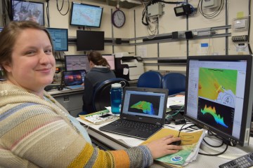
The person you need to make your seafloor map is Kayla Johnson. First, she sends the raw data to a program called MatLab. This nifty software separates the bottom data from all the other stuff in the water column and packages it in something called a .gsf file. Next, this .gsf file goes to this huge processing program called CARIS HIPS, where it is converted into an something called HDCS data.
You’d think that all you’d need to make an accurate seafloor map would be data from the multibeam, but it is actually much more complicated than that (of course you knew that! just look at how long this blog post is). Think about it: while you’re running your survey lines and collecting data, the ocean and, therefore, the ship are MOVING. The ship is heaving, rolling, and pitching, it’s travelling in different directions depending on the survey line, the tides are coming in and out, the temperature and salinity of the water varies, etc. etc. All of these variables affect the data collected by the ME70 and, hence, must be accounted for in the CARIS software. Remember how I said it was HUGE? This is why.

Everyone still with me? Ok, let’s continue processing this data so that Kayla can make our beautiful map. Next up, she’s going to have to load data into CARIS from the POS. POSMV (POSition of Marine Vehicles) is a software interface used on the ship that collects real-time data on where we are in relation to the water (heave, pitch, and roll). She’s also going to load into CARIS the local tide information, since the ship will be closer to the seafloor at low tide than at high. Not including tidal change is a good way to get a messed-up map! Once the POSMV and tide files are loaded into CARIS, they are applied to the survey line.

Next, Kayla has to compute the TPU (Total Propagated Uncertainty). I could spend the next four paragraphs explaining what it is and how it’s computed, but I really don’t feel like writing it and you probably wouldn’t want to read it. Let’s just say that nothing in life is 100% certain, so the TPU accounts for those little uncertainties.
Since the data was collected using multiple beams at a wide angle, there will be beams returning bad data, especially at the edges of the collection zone. Sometime a bad data point could be a fish, but most often bad data happens when there is an abrupt change in seafloor elevation and the beams can’t find the bottom. So, Kayla will need to manually clean out these bad data points in order to get a clean picture of the seafloor.
Almost done! Last, Kayla makes the surface. All the data points are gridded to a certain resolution based on depth (lots of explanation skipped here…you’re welcome), with the end result being a pretty, pretty picture of the bottom of the seafloor. Phew, we made it! These seafloor maps are incredibly important and have numerous applications, including fisheries management, nautical charting, and searching for missing airplanes and shipwrecks (see! I told you there would be a shipwreck!). I’ll be getting into the importance of this mapping cruise to the Channel Islands Marine Sanctuary in my final post, so stay tuned.
Endnote: A word about XBTs

Before all your data are processed, you need to know how fast the sound waves are travelling through the water. When sound is moving through water, changes in temperature and salinity can bend the wave, altering your data. An XBT is an expendable bathythermograph that is sent overboard every four hours. It transmits temperature and salinity readings throughout its quick trip to the ocean bottom, allowing the computer to make data adjustments, as needed.
Did You Know?
Hey, you’ve made it to the bottom of this post! If you are interested in seafloor mapping, have I got an institute of higher learning for you. The College of Charleston has a program called BEAMS, which trains future ocean surveyors and includes a course called Bathymetric Mappings. Three of the hip young scientists on board have taken this course and it seems to be pretty amazing. If you love sailing the high seas AND data processing, you might want to check it out.


